UX Audit Case Study
UX Audit & Redesign of a Content-Heavy Platform
Improving navigation clarity, content discoverability, and the online donation experience through a usability-focused redesign.
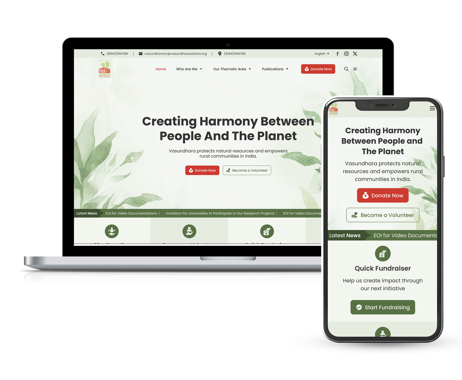
Project Overview
Vasundhara is an action research and policy advocacy organization working to strengthen natural resource governance, climate justice, and sustainable livelihoods across India.
Although the platform contained extensive information about the organization's initiatives, research, and impact, its content-heavy structure made it difficult for users to navigate, discover relevant information, and complete key actions such as donating or volunteering.
The objective of this project was to conduct a UX audit of the existing website and redesign the user experience to improve navigation, content discoverability, and overall usability while creating a more intuitive and engaging experience for visitors.
Client / Industry: Non-profit Organization
Project Scope: UX Audit & Website Redesign
Target Users: Donors, Volunteers, Researchers & Policy Professionals
Role & Responsibilities: UX Audit, UX Strategy, Information Architecture, Interaction Design, UI Design
Tools: Figma · Uizard AI · Notion · Miro
Duration: 4–6 weeks
Understanding the Problem
I conducted a UX audit of the existing website to identify usability issues, improve navigation, and simplify key user journeys.
Research Methods
- UX audit to evaluate the overall user experience
- Heuristic evaluation to identify usability issues
- Competitive analysis to identify industry best practices
- Content audit to assess information hierarchy and readability
Key UX Issues
- Content-heavy experience
- Weak visual hierarchy
- Confusing navigation
- Poor content discoverability
- Inefficient donation journey
- Low visibility of primary CTAs
Key Insights
- Navigation lacked clarity, making important pages difficult to locate
- Dense content reduced scanability, increasing users' cognitive load
- Primary calls-to-action lacked visibility, making key actions less discoverable
- Limited trust indicators reduced confidence in the donation experience
Research Goals
- Understand how users navigate a content-heavy website
- Identify friction in accessing information and completing key actions
- Evaluate opportunities to improve navigation, content discoverability, and user engagement
Competitive Audit & Key UX Gaps
I analysed leading B2B ecommerce and corporate apparel platforms to understand common usability patterns and identify opportunities for improvement.
Navigation
Poor menu organization made important pages difficult to locate
Information Hierarchy
Content lacked a clear structure, making pages difficult to scan
Content Discoverability
Important information was buried within lengthy pages
Donation Journey
Donation pathways required unnecessary effort and lacked guidance
CTA Visibility
Primary actions such as Donate and Volunteer lacked visual prominence
Trust & Credibility
Impact stories and trust indicators were not consistently highlighted
Design Strategy
UX Strategy
Based on research insights, I defined six design priorities to improve usability, simplify navigation, and increase user engagement across the platform.
Navigation & Structure
- Restructured navigation with a clearer information hierarchy
- Grouped content around user goals (Explore, Research, Get Involved)
- Simplified menu organization to reduce cognitive load
Content Readability
- Organized content into scannable sections
- Introduced clear headings, spacing, and visual grouping
- Improved hierarchy to help users quickly understand key information
Content Discoverability
- Surfaced important resources and programs above the fold
- Improved categorization to make content easier to find
- Prioritized high-value information across key pages
Donation & Engagement
- Established a clear hierarchy for primary CTAs
- Highlighted key actions such as Donate and Volunteer
- Simplified the donation journey to reduce friction
Accessibility & Mobile
- Designed responsive layouts across devices
- Improved contrast, readability, and touch targets
- Ensured consistent interactions for mobile users
Trust & Transparency
- Highlighted organizational impact and outcomes
- Added success stories and social proof
- Improved transparency around donations and their impact
Feature Prioritization (MoSCoW Method)
Prioritized features based on user needs, project goals, and implementation impact.
Must Have
- Simplified donation flow
- Clear navigation & IA
- Responsive design
- Accessibility improvements
- Prominent primary CTAs
Should Have
- Impact stories and success metrics
- Volunteer registration flow
- Search and improved content categorization
- Multi-language support (Odia & English)
Could Have
- Event registration and participation
- Newsletter subscription
- Advanced filtering for publications and reports
Won’t (For Now)
- AI-powered chatbot
- Personalized user dashboard
- Online community forum
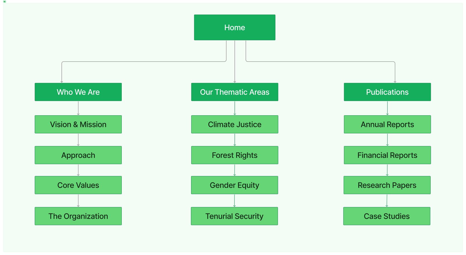
Information Architecture
To improve navigation and content discoverability, I redesigned the information architecture into clear, user-focused categories.

Design Execution
Wireframing & Layout Exploration
Explored multiple layout concepts through low-fidelity wireframes to validate navigation, content hierarchy, and user flows before refining the final interface.
( 📌 Click on any wireframe to view it in full detail. )
Home
(Improving content discoverability)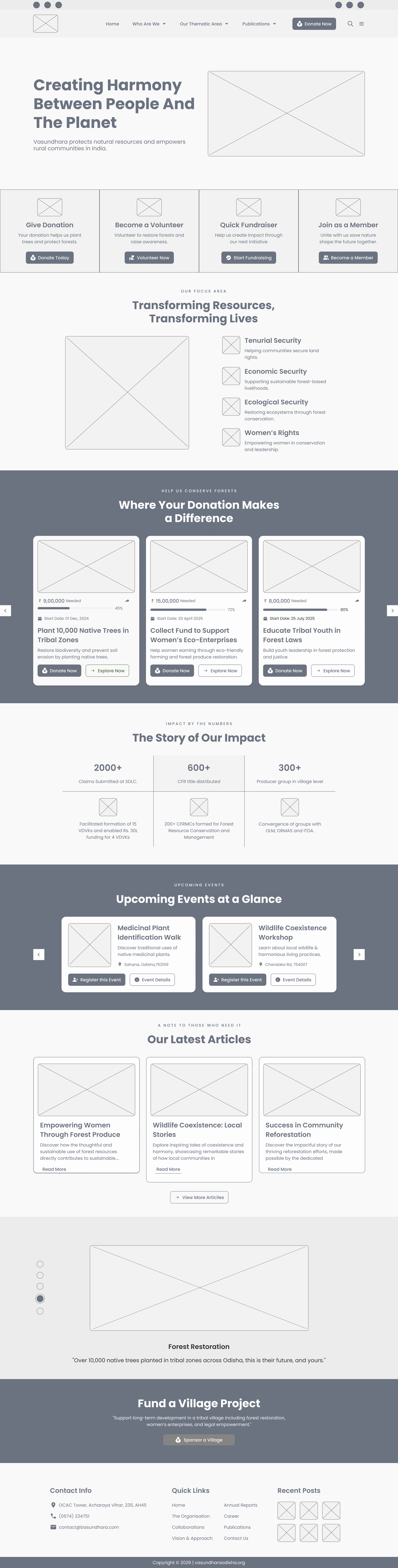
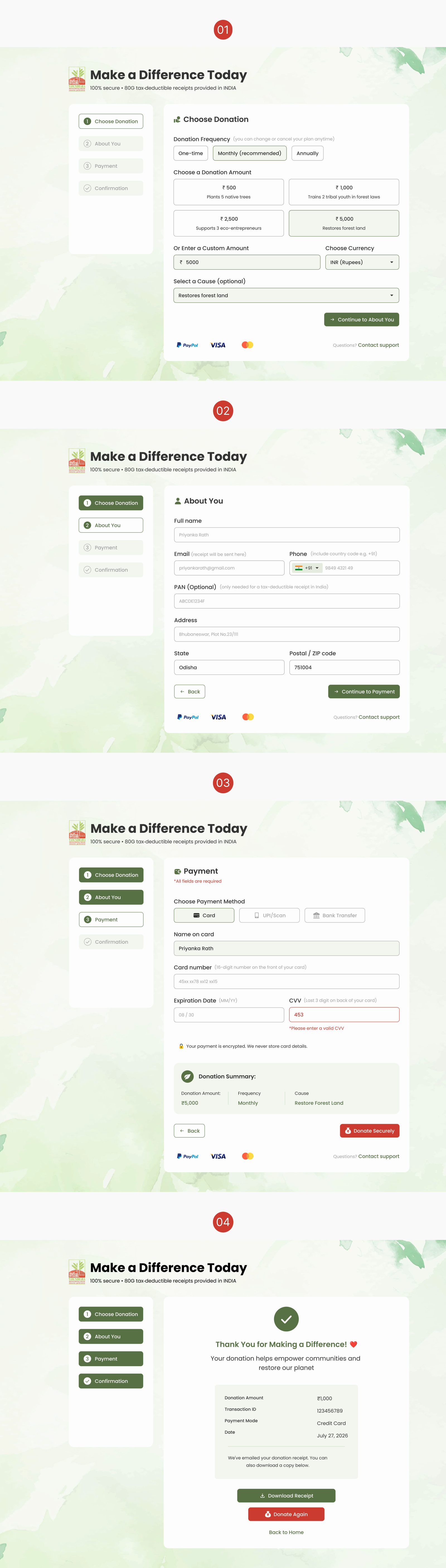
Donation Flow
(Streamlined 4-step donation journey)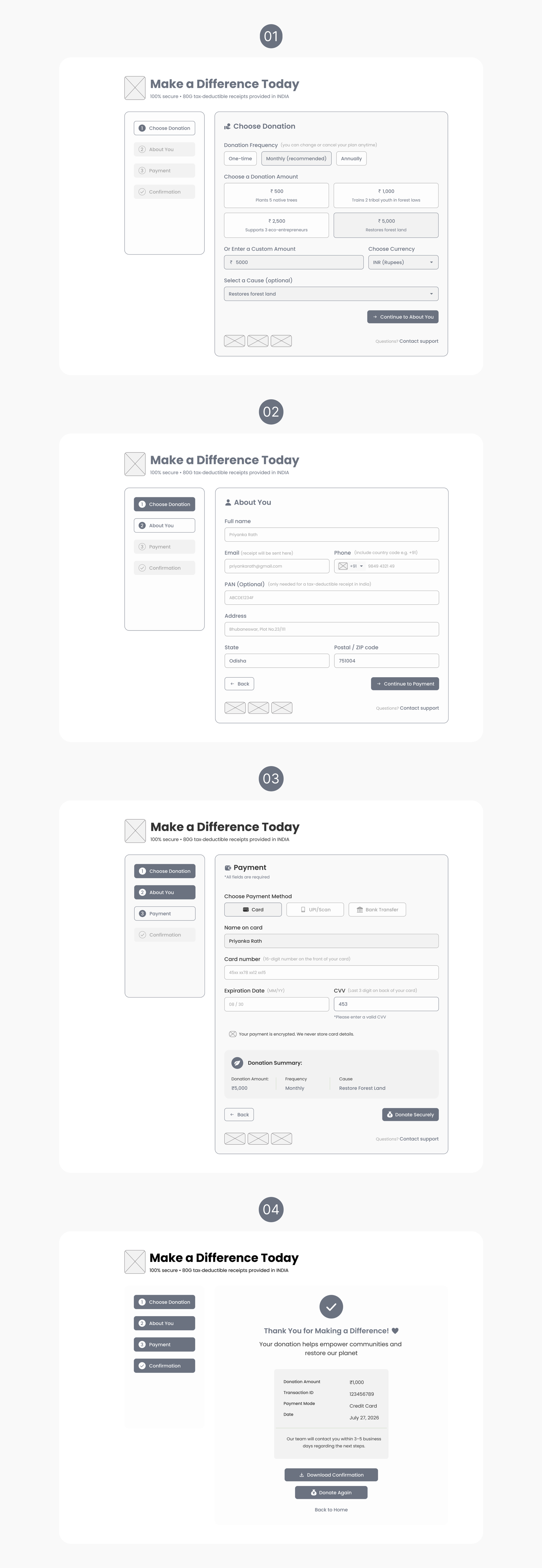
Volunteer Signup
(Simplified 3-step registration flow)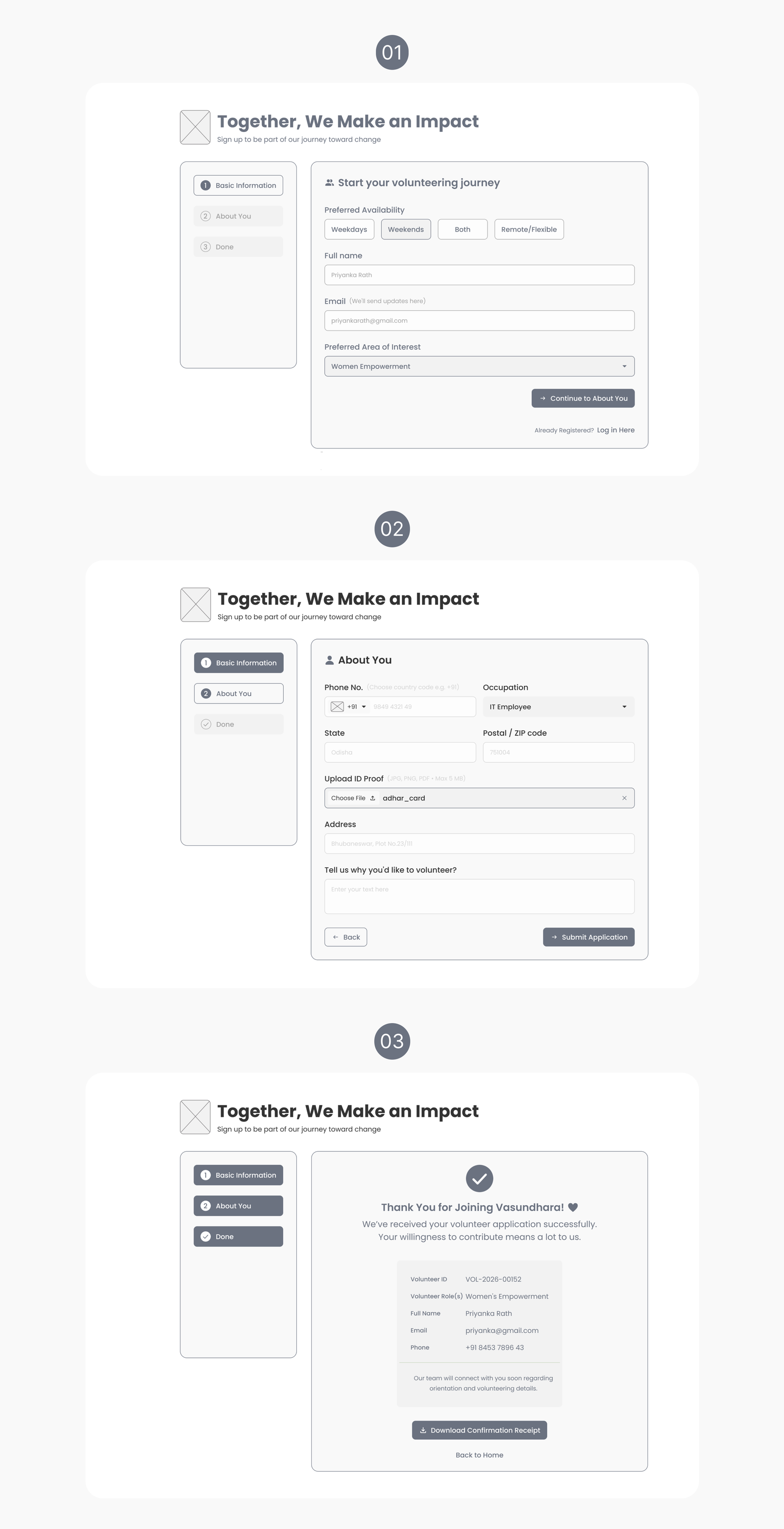
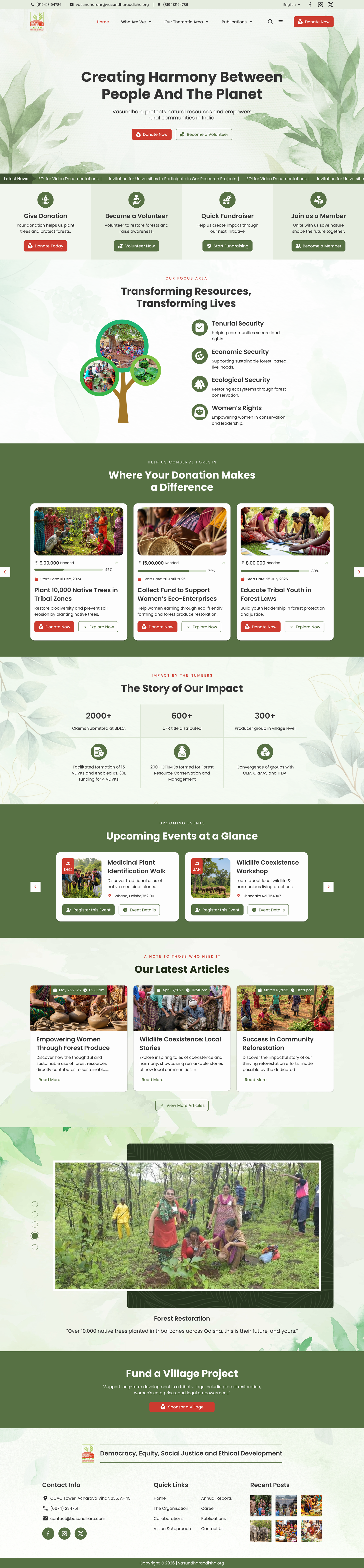
High-Fidelity UI Designs
Based on validated layouts and research insights, the final interface was designed to improve usability, accessibility, and the B2B quote request experience.
(📜 Scroll inside the frame. Tap tabs to switch screens.)
Visual Design Decisions
I refined the visual system to improve clarity, accessibility, and trust while staying aligned with Vasundhara's brand identity.
Color Strategy
The brand's green and red were adapted into an accessible UI system. A darker green became the primary interface color for navigation and supporting actions, while red was reserved exclusively for high-priority donation CTAs.
Responsive Typography Mapping
A consistent responsive type scale was applied. Text defaults to On Background (#333). On colored surfaces, Primary/Secondary (#fdfdfd) is used for accessibility.
The type system is fully responsive with defined breakpoints: Desktop (≥1200px), Tablet (≥768px), and Mobile (<768px).
Hero Title
h1 | Bold (700) 56px (Desktop) → 44px (Tablet) → 36px (Mobile)Section Heading
h2 | Bold (600) 40px (Desktop) → 32px (Tablet) → 24px (Mobile)Card Title
h4 | Semi-bold (600) 24px (Desktop) → 22px (Tablet) → 20px (Mobile)Body Large
p | Regular (400) 20px (Desktop) → 18px (Tablet) → 16px (Mobile)Body Text
p | Regular (400) 16px (Desktop/Tablet/Mobile)LABEL / Small Text
label | Medium (500) 14px (Desktop/Tablet) → 12px (Mobile)Examples of Token Naming
- (Display / Hero) --font-display-lg, --font-display-md, --font-display-sm
- (Section Headings) --font-headline-lg, --font-headline-md, --font-headline-sm
- (Card Titles) --font-title-lg, --font-title-md, --font-title-sm
- (Body) --font-body-large, --font-body-medium, --font-body-small
- (Labels) --font-label-large, --font-label-medium, --font-label-small
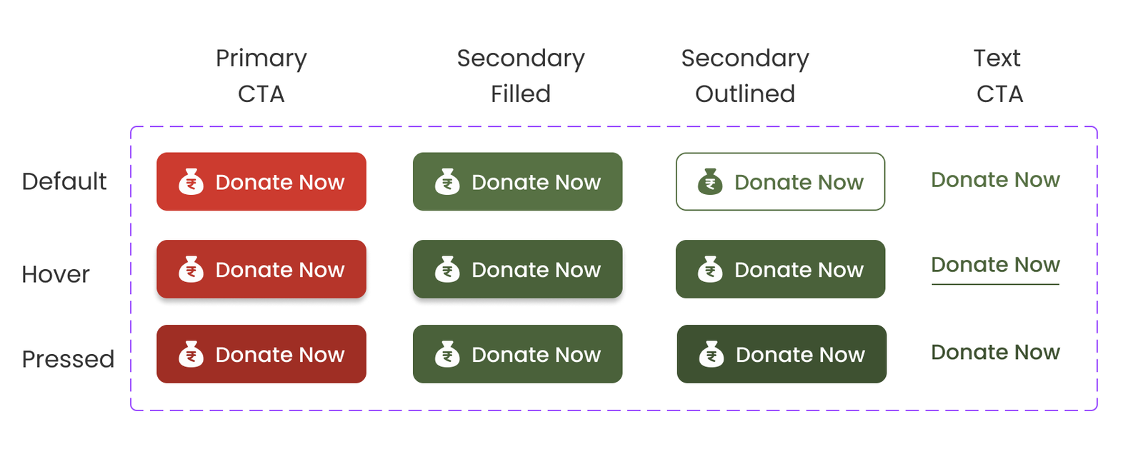
*Button Hierarchy — Inspired by Material 3
Each button type was defined to establish hierarchy and clarity.
- Primary CTA — Filled Red (#CC3B2F): High-priority actions (Donate Now)
- Secondary Filled — Filled Green (#577144): Supporting actions
- Secondary Outlined — Green Outline (#577144): Alternative actions
- Tertiary — Text Only (#577144): Low-emphasis inline actions
Layout & Spacing System
A scalable layout system improves consistency across pages.
- Responsive grid: 12 (desktop), 8 (tablet), 4 (mobile)
- Spacing Scale: Based on an 8px system with 4px increments for fine-tuning.
4 8 12 16 24 32 40 48
- Visual Hierarchy: Used consistent spacing and whitespace to improve readability and reduce cognitive load
Accessibility Guidelines
Accessibility principles were integrated throughout the design.
- WCAG-compliant color contrast- 4.5:1 for body text, 3:1 for large text to improve readability
- Minimum 48×48px touch targets
- Keyboard-friendly interactions
- Semantic structure for assistive technologies
Key Design Decisions
Key design decisions focused on improving clarity, usability, and conversion throughout the B2B product experience.
Improved Trust
Clear CTAs and better information hierarchy
Mobile-First
Responsive, touch-friendly layouts
Simplified Donation Flow
Reduced friction and cognitive load
Reusable Components
Consistent UI patterns across the platform
Validation & Iteration
Usability Testing & Refinements
Conducted usability testing with 6 participants (donors, volunteers, and NGO staff) to evaluate navigation, accessibility, and task completion across key user flows. The findings revealed usability issues that guided refinements to improve clarity, reduce friction, and strengthen user confidence.
Key Findings
- Primary CTA lacked visibility – The donation CTA blended with other interface elements, reducing discoverability.
- Form completion was challenging – Long forms increased friction, particularly on mobile devices.
- Navigation created confusion – Some navigation elements and icons were not immediately intuitive.
- Feedback after actions was insufficient – Users expected clearer confirmation after completing key actions.
Design Improvements
- Strengthened primary CTA visibility.
- Simplified donation and volunteer forms into guided multi-step flows.
- Improved navigation clarity and interaction patterns.
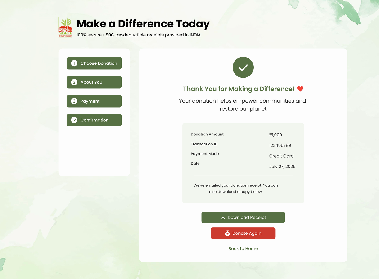
- Added confirmation screens with clear feedback and next steps.
Key Design Iterations
Conducted usability testing with 6 participants (donors, volunteers, and NGO staff) to evaluate clarity, accessibility, and task completion across key flows. The study revealed critical usability gaps that directly informed design improvements.
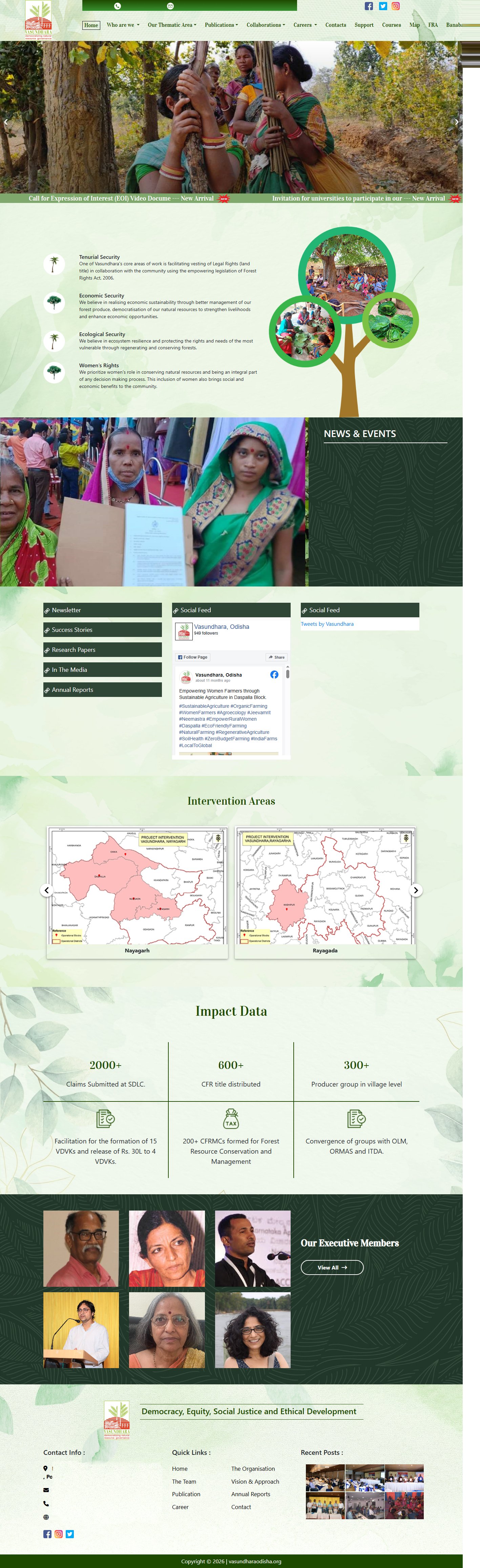
Navigation & Primary CTA Lacked Clarity
Users struggled to find important information and key actions like Donate and Volunteer.
Simplified the navigation, improved content hierarchy, and highlighted the primary Donate CTA to make key actions easier to discover.
( 🔍 Click to enlarge on any image to view it in full detail. )
 Original Experience
Redesigned Experience
Original Experience
Redesigned Experience
( 🔍 Click to enlarge on any image to view it in full detail. )
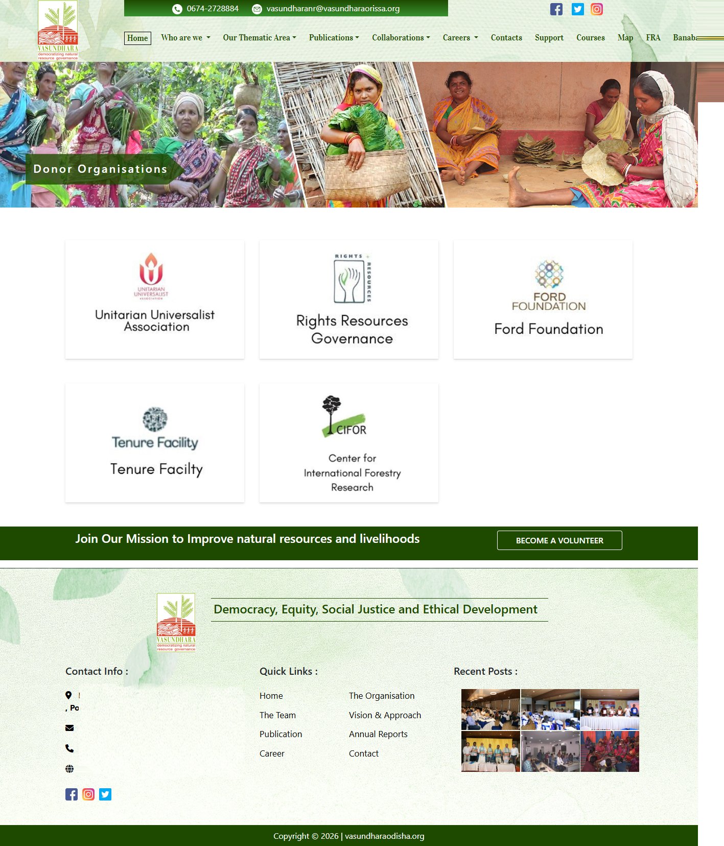 Original Experience
 Redesigned Experience
Long Forms Increased Friction
The donation and volunteer forms felt lengthy, making them harder to complete.(In fact no forms)
Redesigned the forms into guided multi-step flows with progress indicators to reduce effort and improve completion.
Limited Confirmation Feedback
Users received little confirmation after completing donations or volunteer applications.
Added dedicated confirmation screens with submission summaries and clear next steps to reassure users and build confidence.
( 🔍 Click to enlarge on any image to view it in full detail. )
Original Experience
 Redesigned Experience
Results & Reflections
The redesign improved usability, navigation, and content discoverability by addressing key friction points across the donation and volunteer experience.
Impact & Outcomes
-
Improved action visibility:
Established a clear CTA hierarchy, making key actions like Donate and Volunteer easier to discover.
-
Reduced form friction:
Introduced guided multi-step forms to simplify task completion, especially on mobile devices.
-
Enhanced content discoverability:
Reorganized navigation and content hierarchy to help users find information more easily.
-
Strengthened trust & confidence:
Added clear confirmation feedback and transparent user flows to reduce uncertainty.
-
Validated through usability testing:
User feedback informed final refinements and improved the overall user experience.
Key Takeaways
Structure Drives Engagement
Clear hierarchy and navigation improve content discovery.
Visibility Influences Action
Prominent CTAs guide users toward key actions.
Reducing Cognitive Load
Breaking complex tasks into smaller steps improves usability.
Feedback Builds Trust
Clear confirmation and next steps strengthen user confidence.
Final Reflection
This project reinforced that clarity, trust, and simplicity are essential to great user experiences. It also emphasized the value of testing, iteration, and validating design decisions through user feedback.
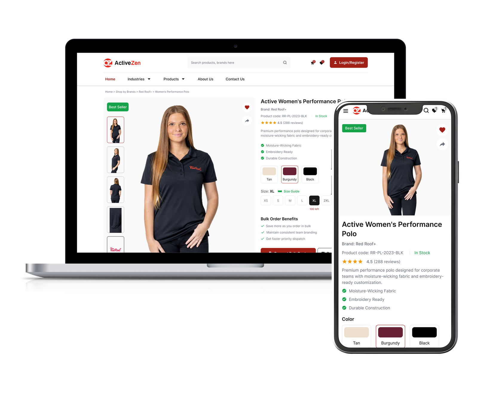
B2B E-commerce Website
Simplifying bulk product purchasing for across USA.
Tribal Help App
Simplifying scheme access for rural users across Odisha.
Get In Touch
Interested in collaborating or have a project in mind? Let's talk!